归航号 · 母舰设计
归航号是一艘承载社区的远征母舰。它要有清楚的航行方向、足够厚重的生活与保全空间,也要有让外出机体认得出的归港入口。玩家靠近时,应先看见一艘船,再发现里面仍在继续的生活。
状态:当前工作方向,概念手稿阶段。 本页展示原创设计研究,尚未作为正式定稿;这套设计尚未完成 Blender 建模,也没有替换 Unity 运行资产。
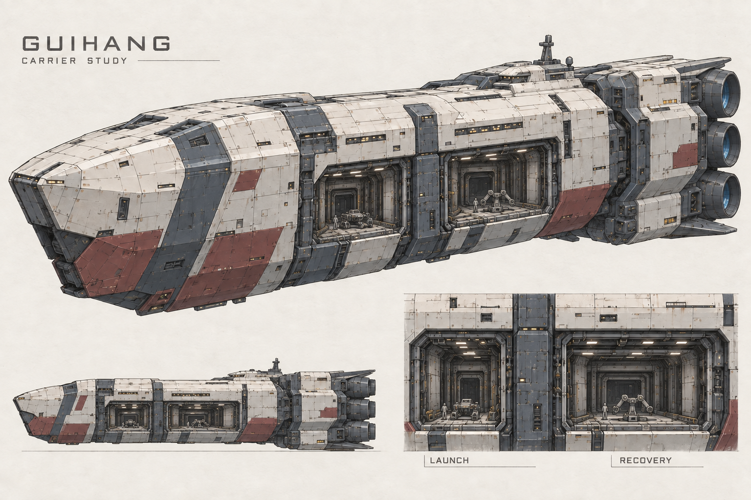
完整生成提示词 2 轮记录 · 原文
AI 图像创作记录 · 保留实际输入原文与修订顺序。
参考图:归航号工业舰船方向初稿
以早期工业舰方向图为编辑输入,转绘为母版手稿;这一步是本手稿的首次生成。
Use case: style-transfer.
Asset type: MASTER HAND-DRAWN CONCEPT SHEET for one original human space-ark carrier GUIHANG. Image 1 is the existing rough design to revise, not a finished ship.
User direction: grounded Mobile Suit Gundam-style naval mechanical design, restrained and handsome, no fantasy monument. FIRST CONCEPT SKETCHES, not Blender renders or final manufacturing drawings.
Revise these specific design weaknesses in the reference:
1. Keep its heavy enclosed long body, short faceted bow, warm-white / slate-blue / graphite / sparse brick-red palette. Replace the monotonous cargo-box profile with THREE clear connected masses: thick protected forward shoulder, slightly recessed midship service waist, broad aft engineering shoulders. These are substantial hull transitions, not wings or added spikes.
2. Make the command bridge a LOW compact semi-recessed armored island in the aft third. Remove the tall forest of naval antenna masts and the giant row of bridge windows. The ship is kilometer-class; fine grouped inhabited window lights must be tiny. Keep one short sensor mast.
3. On the visible PORT side of the midship service waist, clearly show TWO distinct rectangular recessed mouths side by side along the hull length, separated by a thick structural pier. The FORWARD mouth is LAUNCH; the AFT mouth is RECOVERY, a little wider. Actual dark tunnel depth, outer doors, inner framing and guides visible in BOTH mouths. These are side-facing, safely ahead of the stern thrusters. A tiny original humanoid mobile-frame in the launch cradle and a tiny four-arm industrial frame near the recovery mouth identify the carrier's role. No generic shuttle as the only payload.
4. The stern has SIX main engine apertures TOTAL, arranged as TWO columns of THREE, clearly built into sturdy structural modules. Fore-aft direction obvious. From the hero view only the near bank and part of the far bank need be visible. Small attitude thrusters and short cooling vanes; not giant fins.
5. Preserve a broad quiet sealed forebody for sleeping community, a thin grouped habitation band above the waist, dense service details only around the two ports, and separately colored aft machinery. A few replaced panels and dark sealed sectors imply a long life; no luxurious terraces or exposed parks.
Layout 1536x1024 landscape, tasteful HAND-DRAWN DESIGN SKETCH presentation on off-white paper. Top 70 percent: one complete revised mother ship in front-port three-quarter view, enough side visible to read both ports, generous margins. Bottom left 25 percent: small strict SIDE silhouette sketch of the SAME ship, showing the low bridge and three mass transitions. Bottom right 25 percent: enlarged mechanical detail of the SAME paired side ports with central divider, 20-meter-class mecha dwarfed by the doorway, thick opening rim and inner rail/capture frame. Labels ONLY "GUIHANG / CARRIER STUDY", "LAUNCH", "RECOVERY" in small restrained drafting typography. No fake handwritten paragraphs, no dimensions, no second ship alternative.
Style: professional original anime-mecha designer's exploratory pen/pencil and marker sheet, clean purposeful contour lines with subtle construction lines, restrained color blocking, crisp shaded angular surfaces, legible dark mechanical recesses. Beauty through proportions and controlled detail. NOT a photograph, CGI product render, stone building, rounded seed, crown, scythe, luxury liner or toy. Do not copy Archangel's split prow, any Gundam logo or any existing franchise ship. No gun batteries, space background, planets or bright engine bloom. This is a concept mother sheet, not a validated technical projection.
局部修订母版初稿;输入为保留的返修前版本。
Use case: precise-object-edit.
Image 1 is the edit target, a hand-drawn master sheet for the original GUIHANG mother ship. Retain the main ship's silhouette, materials, color placement, camera, page layout, title, three-level stern engine bank and low bridge. Make ONLY a coordinated drawing-consistency correction:
A. The lower-left side-view inset incorrectly lacks the two visible PORT side openings. Replace that small inset with a true PORT side elevation of the SAME hero ship: short angled bow, same low bridge position, same armored midship waist containing TWO rectangular mouths separated by the same broad vertical pier, forward mouth launch and aft mouth recovery. Same height and fore-aft positions relative to the body as the hero. Do not label the incorrect old drawing as another side.
B. In BOTH main hero and bottom-right port-detail inset, replace the recognizable colorful humanoid with a tiny neutral grey industrial humanoid scale placeholder and the industrial machine with a comparably small grey 4-arm placeholder. Their height must be about ONE FIFTH of each LARGE exterior service-bay aperture, NOT half. Preserve exactly the same relative size in hero and detail. Large exterior service alcoves are not themselves human-sized airlocks.
C. Deep inside each of these large exterior service mouths, clearly indicate a smaller framed machine transit throat, a supported guide/capture cradle and a visible heavy sliding panel parked in a side pocket. The vehicle remains about half the smaller inner transit throat's height. Use simple modular parallel guide structures, not a busy factory maze. The space between the paired mouths remains solid, structural and consistent in all views. The labels LAUNCH and RECOVERY remain attached to the correct corresponding mouths.
D. Keep the underlying drawing restrained and hand-drafted, with graphite and marker shading on warm paper; no dimension numbers, no invented diagrams, no additional vessels or labels, no change to the rest of the ship.
This is visual concept coherence, not engineering certification. Make the same object repeat faithfully across the sheet.
完整保留该手稿首次绘制到此版本的提示词原文。历史指令可能包含后来修改或图面尚未达成的要求,不代替概念评审。
这张图的永久记录 ↗主视图建立整体身份,侧视与局部用于检查同一艘船的部件关系。三处图像仍属于概念表达,不能直接作为统一比例的施工图。
一艘可以回家的工业母舰
跳转到“一艘可以回家的工业母舰”当前方向从高达系舰船的体块组织中提炼工业感:连续的长轴、短而厚实的折面舰艏、受保护的小型舰桥,以及明确成组的艉部推进器。它保留承载社区所需的体量,也让机库、检修与机体活动成为外观的一部分。
左舷中段的双港是主要识别点。前港负责出击,后港负责回收;两者共享母舰的维护体系,各自保留独立入口。门洞需要有厚度、内部通道和固定设施,不能只是一块黑色贴图。
这艘船的情绪来自“正在恢复的生活”:少量亮着灯的工作区、关闭的库位、修补过的部件,以及逐渐重新启用的公共空间。成长会改变船上的活动,而不只是增加外壳装饰。
共同的制造语言
跳转到“共同的制造语言”| 层次 | 当前设计取向 |
|---|---|
| 大体量 | 连续主舰身、厚实前肩、内收港区、集中的后动力段 |
| 色彩 | 暖灰白外板、蓝灰结构、石墨色机械深处;砖红用于少量识别区 |
| 细节 | 大面留白,港口、接缝与检修处集中机械细节 |
| 灯光 | 琥珀色强调操作与锁定位置,居住光带表现生活尺度 |
| 使用痕迹 | 磨损集中在夹持、检修和接触处,补焊与换件保留年代差异 |
同一套语言延伸到舰桥、餐舱和三类机体。它们不必外形相同,但应让人相信来自同一套制造与维修体系。
当前已收敛与仍待解决
跳转到“当前已收敛与仍待解决”跨页评阅已确认主轮廓、色块、左舷双港、紧凑舰桥与六喷口的主要身份关系。早期侧视漏画港口、发动机数量不一致等问题已经返修,过程见退回方案与返修记录。
统一尺度仍未通过。 全舰、机体、人物与港口局部还没有放入同一张可靠标尺页;公里级舰体与约二十米级机体只是探索中的设计输入。后续必须把这些关系画清,再进入三维空间与动作验证。
公开参考
跳转到“公开参考”舰船形体研究参考了官方展示的大天使号、千年号与阿伽门农级。本作借鉴大部件层级与机械组织方式,归航号的港口、社区使命和制造语言仍需由自身设计建立。